
News
tattoo shop decor: How to pick the right size & spot for metal signs
Aug
Tattoo Shop Decor: How to pick the right size & spot for metal signs
There’s a moment I’ve seen a hundred times in the packing bay: a shop owner opens a box, holds up a metal sign and freezes — beautiful, but too big for the reception wall they imagined. Or the opposite: a tiny plaque disappears behind a couch. I’ve packed thousands of signs for tattoo studios, and the problem is almost always the same: size and placement weren’t planned before the order.
This guide walks you through the steps I’d use if I were fitting out my own studio — measure first, choose size by location, mount it safely, and style around it so the sign looks intentional, not accidental. Practical, no-nonsense tips from someone who’s seen what works on real shop walls.
Check a popular metal tattoo machine sign for scale ideas
View metal tattoo machine sign →
Table of Contents
- Why metal signs work in tattoo studios
- Step 1 — Measure the space before you buy
- Step 2 — Choose size by location
- Step 3 — Mounting and safety
- Step 4 — Styling and pairing with other décor
- Choosing finishes, fonts, and readability
- Building a cohesive studio aesthetic
- Buying practicalities and material notes
- Home-studio and personal workspace ideas
- FAQ
- Conclusion
Why metal signs work in tattoo studios
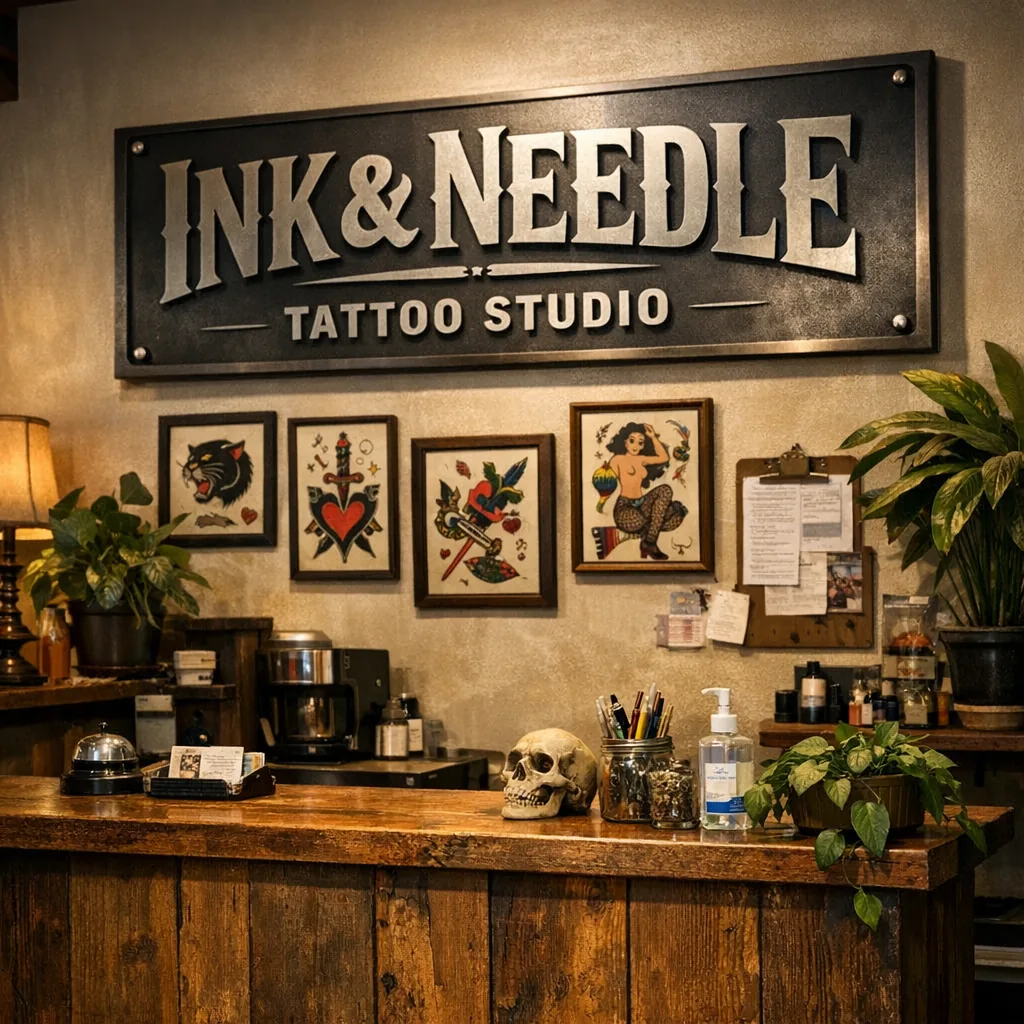
Metal signs are almost tailor-made for tattoo shop wall decor. They read clearly from a distance, have bold silhouettes that stand up to busy walls, and the laser-cut edges give a crisp, handcrafted look that pairs with inked artwork. Powder-coated steel holds up to humid rooms and the general wear a working studio sees. They bring an industrial-artsy vibe that lives comfortably next to framed flash sheets, exposed brick, and concrete floors.
Step 1 — Measure the space before you buy
Do this before you browse. Really. Walk in with a tape measure and note the usable wall area, then record three numbers: width, height, and sight-line height (where a person’s eye will naturally fall when standing in the room).
- Measure across the wall, not just the space between furniture. The sign should breathe.
- Mark the center point on the wall with a small piece of painter’s tape — this will be your anchor for visualizing sizes.
- Use masking tape to outline potential sign sizes on the wall. You’ll be surprised what looks right and what doesn’t.
Example: a 6-foot reception wall might look balanced with a sign 30–36 inches wide. A narrow hallway of 3.5 feet will feel crowded with anything over 18 inches.
Step 2 — Choose size by location
Here’s how I decide size for the usual spots in a shop. I’ll give specific size ranges — they’re based on what I’ve seen hang well and pass the “walk-in glance” test.
Reception area / feature wall
This is where the shop name or logo usually goes. Aim for a sign that occupies roughly 40–60% of the wall width if it’s the single focal point.
- Wall width 6–8 ft: choose 28–42 in sign.
- Smaller lobby (4–6 ft): 20–30 in.
- Balance with seating — keep 6–12 in of clear wall on either side if possible.
Waiting room / gallery walls
Mix smaller pieces rather than one oversized sign. I like 12–18 inch plaques or two to three smaller pieces grouped together.
Tattoo stations / work walls
Keep signs smaller and readable from the artist’s chair. A 12–24 in sign with the artist’s name, logo, or a short quote works well above a station or near the light source so it isn’t backlit.
Hallways and doorways
Slim, vertical pieces look good in corridors — 8–16 in wide and longer if the ceiling allows. For doors, keep it under half the door width so hinges and hardware aren’t crowded.
Window and exterior use
For windows, reverse-read or mirrored signage needs testing at full scale. Exterior signs should be larger so they read from the curb; think 36 in plus for storefronts depending on distance.
Step 3 — Mounting and safety
Mounting is where a lot of DIY jobs go sideways. Signs that aren’t secured properly will wobble, sag, or worse. Here’s a practical approach I use on the shop floor.
- Know your wall material: drywall, brick, plaster, or wood each needs different anchors. Use molly bolts for drywall; masonry anchors for brick/concrete.
- Use a level and mark holes at the exact centerline. If the sign is heavy, use two anchors spread at the sign’s mounting points.
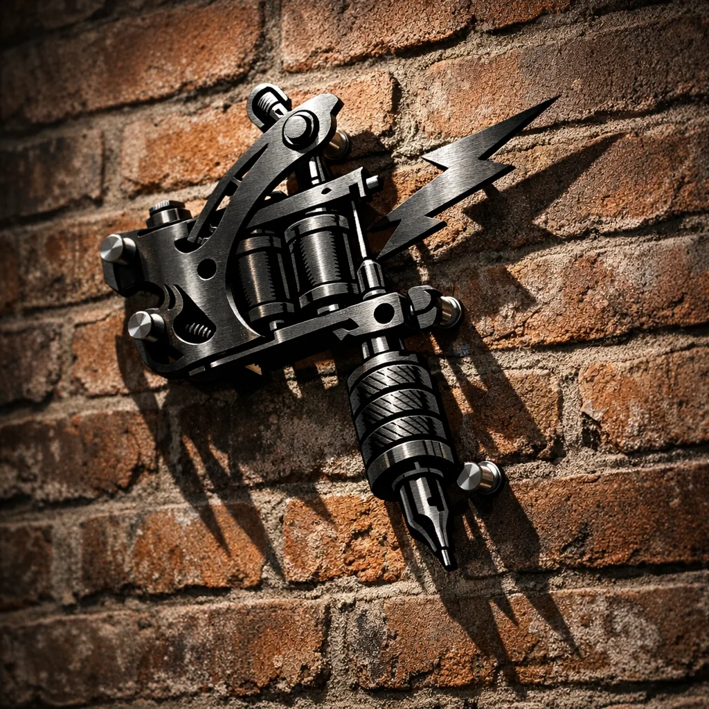
- Consider spacers for a floating look — 1/2″ to 1″ standoffs give shadow depth and keep the sign from rattling.
- For outdoor use, make sure hardware is stainless or galvanized to avoid rust at the mount points.
Quick rule: anything over 20 lbs needs at least two secure anchors. If you’re unsure, have someone hold the sign while you test placement before drilling.
Step 4 — Styling and pairing with other décor
Metal signs rarely stand alone in a tattoo studio. Pairing them right is what makes them feel like part of the room instead of an afterthought.
Lighting
- Uplights or picture lights emphasize laser-cut edges and create dramatic shadows.
- Backlighting behind a cutout sign gives a halo effect — useful for logos or lettering to increase legibility.
Mixing materials
Place a metal sign on or above a reclaimed wood panel for warmth. Concrete or exposed brick pairs naturally with steel for an industrial look. Mirrors and plants soften a hard metal edge and make the room friendlier.
Framed art and flash sheets
Alternate framed prints with metal pieces to break monotony. Keep consistent mat or frame colors so the eye reads the gallery wall as one composition. Don’t cluster too tightly — leave breathing room.
Choosing finishes, fonts, and readability
Design choices decide whether a sign reads well from across the room.
- Finish: matte black is still our best-seller — high contrast on light walls. Powder-coated colors resist chips and are okay for outdoor pieces.
- Fonts: bold, simple typefaces read best at a distance. Script looks great up close but can blur from the waiting area.
- Contrast: ensure the sign color contrasts with the wall. If you want a subtle look, use standoffs to cast shadow and improve legibility.
- Sizing text: as a rule of thumb, 1 inch of letter height is readable from about 10 feet — adjust up for bigger rooms.

Design ideas for tattoo shop wall decor
Tattoo motifs are familiar for a reason. They communicate instantly and give clients an immediate sense of your shop’s flavor.
- Tattoo machine silhouettes — clean, recognizable and a favorite above reception desks.
- Skulls, snakes, roses, and traditional flash motifs that read as icons from far away.
- Anatomical pieces for studios leaning toward realism or educational aesthetics.
- Lettering: artist names, shop logos, established-year signs, or short quotes work well in metal and become signature pieces.
- Custom quotes or shop mottos laser-cut into a panel for a personal touch.
For scale reference, I’ve shipped 24–36 in machine designs for reception areas and 12–20 in name plates for individual stations — both tested and proven in busy shops.
Building a cohesive tattoo-studio aesthetic
Your overall style determines how metal signs should look and be placed. Here’s a quick breakdown so you can match the sign to the vibe.
- Traditional: bold lines, vintage flash, darker wood frames, and warm lighting.
- Minimalist: thin, negative-space pieces, monochrome palette, plenty of white/black space.
- Industrial: exposed brick, concrete floors, powder-coated metal with raw edges.
- Gothic: ornate lettering, darker finishes, candle-like lighting or Edison bulbs.
- Vintage: patina-style finishes, mixed with old mirrors and distressed wood.
Pick one dominant aesthetic and let three or four support pieces echo it. Too many competing directions make the space feel confused.
Practical buying guidance
When you’re ready to buy, have this checklist handy:
- Material: powder-coated steel for durability and indoor/outdoor use.
- Finish: choose based on wall color and exposure — matte for inside, UV-resistant powder coat for sun-exposed spots.
- Size: confirm measured wall templates before ordering.
- Readability: request mockups or scaled previews of lettering and logos.
- Mounting options: ask about standoffs, keyhole slots, or tabs; specify if you need pre-drilled holes.
- Customization: get the artist name, logo, or established year laid out and approved — small tweaks to spacing change the whole balance.
Decorating a home studio or personal workspace
If you’re setting up a home studio, scale everything down a notch. A 16–24 in sign above a compact workstation is often perfect. Consider:
- Using one signature piece (logo or name) rather than a gallery wall.
- Adding a small shelf below the sign for tools, plants, or reference books.
- Choosing finishes that don’t overpower a living space — darker, low-gloss tones generally sit better in homes.
At home, the sign should reflect you as an artist first, and a business second.
Emotional side — décor that tells your story
Clients often tell me they remember a shop because of one detail: a name plate above the chair, a hand-cut logo on reclaimed wood, or a quote in the hallway. These elements say who you are as much as your portfolio does. A personalized metal sign with the artist name or established year can turn a place into a brand, and a brand into a memory.
I once helped a young artist resize a custom machine sign after she opened her first storefront. She’d picked a huge piece — fantastic design — but it swallowed her small waiting area. We recommended a slimmer version for the lobby and kept the original for a feature behind the main station. Clients later told her they already felt like they knew the shop because that smaller sign made the entry feel intentional and calm. It’s the little choices that shape first impressions.
FAQ
How do I decide the right sign size for a reception wall in my tattoo shop?
Measure the wall width and aim for the sign to occupy about 40–60% of that width if it’s the main focal point. Use painter’s tape to mock up the dimensions before you buy to confirm visual balance.
What mounting method should I use for a 30–36 inch metal logo above a waiting area?
For a piece that size, use two to four anchors depending on weight and wall material; include standoffs if you want depth. On drywall, use heavy-duty molly bolts; on brick or concrete, masonry anchors are best.
Which finish and font choices improve readability for tattoo shop wall art?
High-contrast finishes (black on a light wall or light on a dark wall) and bold, simple typefaces read best from a distance. Reserve ornate scripts for smaller pieces near the station where clients can read up close.
How can I combine metal signs with framed flash sheets without making the wall look cluttered?
Create consistent spacing and a repeatable rhythm: match frame colors or mat widths, leave equal gaps between pieces, and use one larger metal focal point rather than several competing metal items.
Can I use personalized metal signs outdoors for my tattoo shop frontage?
Yes, powder-coated steel designed for outdoor use will hold up, but make sure the mounting hardware is rust-resistant and that the finish is UV-stable to avoid fading over time.
Conclusion
Good tattoo shop decor starts with measurement and a plan. Measure the wall, mock up sizes with tape, choose finishes and fonts that read from the right distance, and mount securely. Pair metal signs with the right lighting and materials so they feel like part of the room, not an afterthought. Do these things and your signage will not only say who you are — it’ll make the studio feel like a deliberate piece of your art.
