
News
Personalized Coffee-Themed Wall Art
Aug
Personalized Coffee-Themed Wall Art
A regular question I hear after someone orders a custom coffee sign is: “Is this the right size?” It’s a fair one — scale changes everything. Too small and the piece looks tacked on; too big and it takes over. Below I walk through practical steps and everyday tips I give customers so a coffee-themed metal sign actually feels like it belongs, not like an afterthought.
Shop Personalized Coffee-Themed Wall Art
Step 1 — Measure the wall before you buy
Start with a tape measure and note the maximum width and height where the sign will hang. Look at nearby elements: counters, cabinets, window trim, shelves and ceiling height. A sign that sits nicely under an 8-foot ceiling can feel lost under 9 feet.
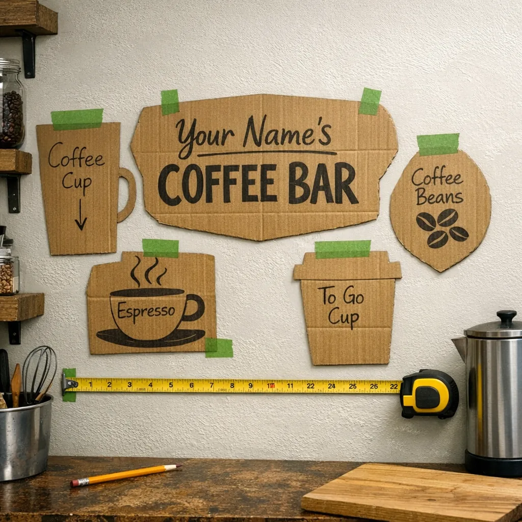
Make a quick mock-up from cardboard or kraft paper cut to the size you’re considering and tape it to the wall. Live with that shape for a day or two and view it from standing, sitting and from across the room. That simple test usually answers whether the piece reads well or is fighting with nearby items.
Step 2 — Choose size by location
Where the sign will hang should guide the size. From hundreds of installs, these practical ranges tend to keep things balanced and legible.
Front of a kitchen island or coffee bar
- Be bolder here. A 24–30 inch wide sign usually reads well above an island or a dedicated coffee station. For longer runs, center a larger piece and balance it with smaller shelves or prints on either side.
Above the espresso machine or countertop
- Smaller is safer: 12–18 inches fits without crowding appliances. If you need the wording readable from across the kitchen, pick the upper end of that range.
Breakfast nook or dining area
- Measure the bench or table and aim to fill roughly two-thirds of that width. A family-name sign or a short phrase gives the nook personality without overpowering it.
Open wall or gallery grouping
- Mix sizes for interest: pair a larger quote (20–26 inches) with a couple of smaller pieces—mug silhouettes, small framed photos or a narrow shelf. Keep spacing even so the composition doesn’t look top-heavy.
Step 3 — Pick material and finish with purpose
Metal performs well indoors; it resists steam and splashes better than paper or linen. Raw steel and matte black suit farmhouse or industrial looks; warmer powder-coat finishes play nicely with wood. Black is versatile and usually reads clearly against backsplashes, which is why I recommend it often.
Think texture: a slightly distressed finish adds character; a smooth powder coat feels cleaner and more contemporary. When possible, tie the sign’s finish to nearby hardware—those small echoes make the whole area feel intentional instead of accidental.
What to personalize and why
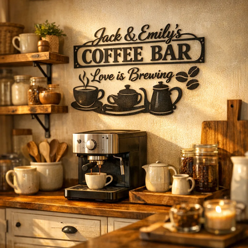
Personalization is what makes the piece yours. Popular choices are last names, initials, an establishment year, or a short coffee phrase. Keep text concise so letters remain legible at normal viewing distances. Above a counter, shorter text or initials work better than a long sentence.
Symbols help when you want personality without clutter: a small heart, a coffee bean icon, or a year paired with a family name all communicate intent without crowding the layout.
Step 4 — Placement and mounting tips
Metal signs are often lighter than framed canvas, but solid mounting still matters. A few practical tips:
- Drywall: use toggle bolts or molly anchors for items over about 8 pounds.
- Studs: try to land at least one screw in a stud when possible.
- Tile backsplashes: either use proper tile anchors or mount to the cabinet face above to avoid drilling tile.
For a floating look, small standoff screws create a pleasant shadow gap. For a flush fit, keyhole slots or D-rings work fine. And don’t forget the small stuff: double-check spelling and layout on personalization proofs — catching typos early saves headaches later.
Step 5 — Styling tips to make the sign belong
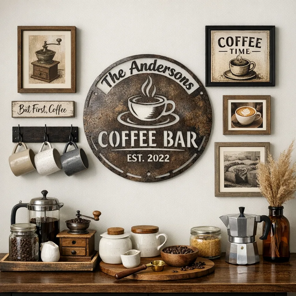
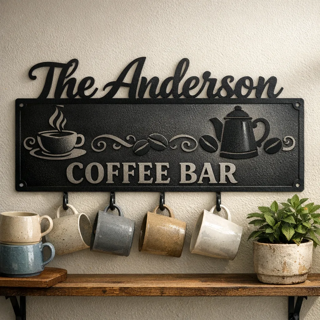
Treat the sign as the anchor of a small vignette. Match metal finishes to nearby fixtures when you can, and keep surrounding elements cohesive. If the backsplash is busy, choose a simple sign with clear lettering. In a rustic kitchen, pair a warm-toned metal sign with reclaimed wood shelves and a few ceramic mugs on display.
For a coffee corner, add a tray with mugs, a small potted plant and one framed photo or a favorite recipe card. Those extras make the area feel lived-in rather than staged — the sign sets the theme and the objects tell the story.
How size affects readability and the room’s feel
Small signs act as accents; large signs read as statements. If your kitchen opens to a living area, size up so the text is legible from across the room. In a tight nook, keep the sign modest so it complements rather than competes.
Pay attention to sightlines: where will guests usually be standing or sitting when they look at the piece? That viewing distance determines the minimum letter height you’ll need for comfortable reading. A simple rule: multiply the letter height by about 10 to estimate the readable distance in inches.
Maintenance and longevity
Metal art is low-maintenance. Wipe with a soft cloth and a mild cleaner; avoid abrasive pads or harsh chemicals that can damage the finish. For covered patios or humid spots, choose a powder-coated finish for better resistance to moisture and UV. If you like a rusty patina, keep the piece indoors or in a sheltered outdoor spot so the patina develops predictably instead of rapidly corroding.
Quick checklist before you order
- Measure the wall and make a cardboard mock-up.
- Decide how far away the piece should be readable from.
- Pick a finish that relates to nearby fixtures.
- Keep personalization short or use initials/icons for clarity.
- Choose anchors appropriate for your wall type.
- Confirm spelling and layout on proofs before finalizing.
- Consider shipping and lead time if you’re working on a deadline (holidays, parties, etc.).
I keep a photo folder of customer installs in the workshop — seeing real setups is the best way to judge scale and finish. If you want, send a phone picture of your space and the measurements; I’ll give a quick size recommendation based on what I see.
FAQ
What size should I choose for a small breakfast nook?
Usually 12–18 inches works well. That range reads up close and fits above a bench or narrow counter without overwhelming the area. Narrow rectangles or circles help when width is limited.
Can long family names or quotes be personalized and still be readable?
Long text tends to crowd the design. Consider initials, a shortened phrase, or splitting the name into two lines on a slightly larger sign. Shorter copy keeps letter sizing comfortable and improves readability.
How do I arrange a gallery wall with a coffee sign?
Use the coffee sign as the anchor and arrange smaller pieces around it, leaving 2–4 inches between elements. Make paper templates to test layouts on the wall before committing — it removes guesswork and saves time.
Which finishes suit farmhouse vs. modern kitchens?
Farmhouse: matte black, raw steel or textured rustic finishes pair well with wood and ceramics. Modern: smooth powder-coat in black, white or muted metallics reads cleaner and more contemporary.
How high above a counter should I hang the sign?
Hang the bottom edge about 4–6 inches above the counter or appliance to give clearance for items and to keep the artwork visually connected to the station below.
Where are you thinking of putting your sign? Share the space dimensions or a photo and I’ll suggest a size range that will look intentional.
