
News
Custom Farmhouse Name Signs
Aug
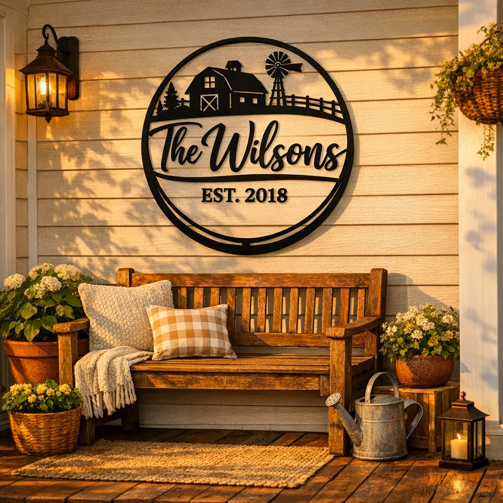
Late afternoon light turns a porch into a little scene: a slow-swinging bench, a fern dripping soft shadow, footprints darkening the welcome mat, and a blank strip of wall above the door that’s quietly waiting. A custom farmhouse name sign often does the job — a small, literal answer to that empty space. It greets visitors, names the household, and helps the entry feel finished rather than incidental.
I pack these signs in our Garland workshop and I’ve watched the decision-making closely. People come with photos of their porches, paint swatches, or a measurement scribbled on a napkin. They debate font weight, whether an ampersand looks right between two first names, and if adding an established year is worth it. Those tiny choices are what make a manufactured piece read as personal and lived-in.
Shop Farmhouse Welcome Signs →
What a custom farmhouse name sign is — and why it fits
At its simplest: a personalized wall sign with a rustic or country-inspired character. Commonly it shows a last name, initials, first names, or a short phrase, rendered in materials and finishes that feel at home in farmhouse interiors — think powder-coated metal, weathered wood, or matte-painted cutouts. They work because they read clearly from a distance, add texture and scale to a wall, and lend a little personality without shouting.
Styles and themes to consider
Farmhouse styling covers a lot of ground, from rough-and-ready to restrained modern. The trick is to pick the look that answers the room’s mood rather than trying to force one sign to be all things.
Rustic & farmhouse
Darker metals, hand-lettered scripts, and deliberately worn edges. These pair naturally with reclaimed benches, iron lanterns, and knotty wood walls.
Modern farmhouse & minimalist
Clean geometry, sans-serif lettering, and a single-color finish. This reads calm and collected against painted consoles or white shiplap.
Vintage & distressed
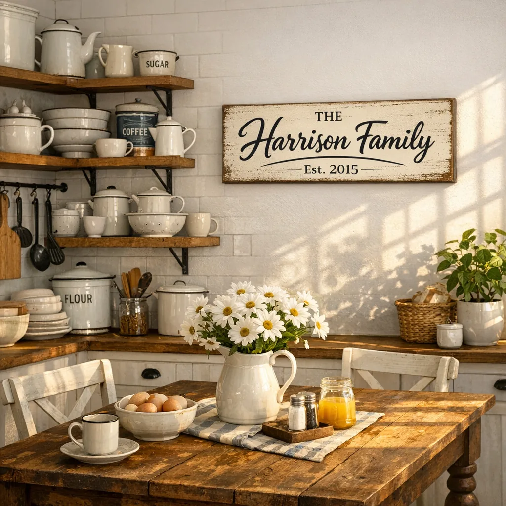
Faux rust, layered paints, or sanded-through edges give a sign a lived-in history. Lovely in kitchens with open shelving, enamelware, and a touch of patina elsewhere.
Country & traditional
Ornamental flourishes, wreaths, and serif type feel a bit more formal — useful in dining rooms or classic entry halls where you want tradition to show.
What to put on your sign
There’s no single right answer. Some combinations keep coming up because they work visually and emotionally:
- Last name alone: “The Wards” — simple, direct, and timeless.
- Last name + established year: “The Parkers • Est. 2015” — gives the piece a small slice of history.
- First names or initials with an ampersand: “Mia & Jon” — intimate and tidy.
- Address number + family name: useful and practical by a garage or mailbox.
- Short family phrase with a name underneath: “Home Sweet Home” with the surname beneath softens the statement.
From the packing table: if the sign is a housewarming gift, people often notice the small personal touches — an address or an established year — and those details land better than you might expect.
Where to hang a farmhouse name sign
Placement changes how a sign reads. Think about scale and sightlines — the same piece will feel different above a bench, over a mantel, or at a kitchen pass-through.
Front porch & entryway
The obvious spot. Above a bench or door, wider signs (24–36 inches) usually read best from the sidewalk. For a narrow porch, a taller, slimmer sign balances the vertical space more naturally.
Living room or family room
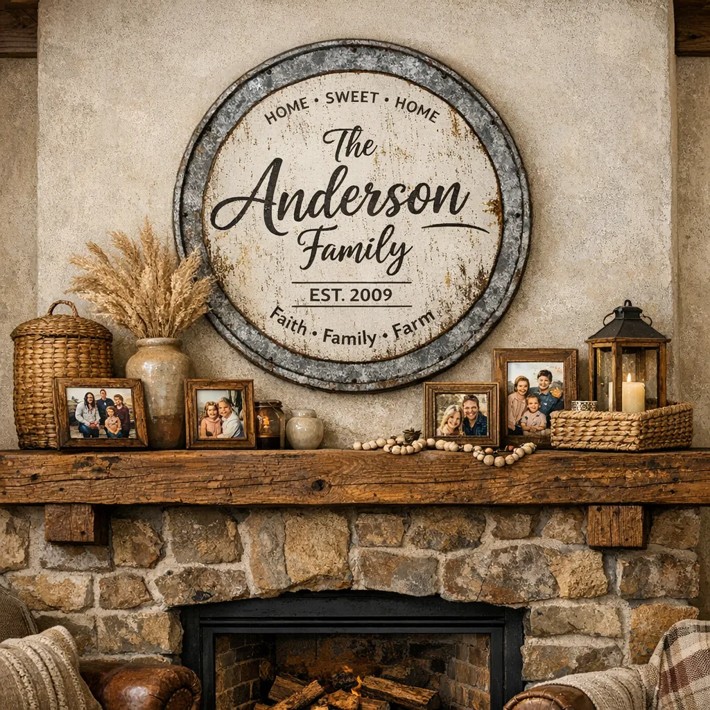
Above a mantel or as the anchor in a gallery wall, a sign can pull photos and shelves together. Match the sign’s metal tone to nearby fixtures if you want visual continuity.
Kitchen or dining room
Smaller plaques and signs with culinary motifs — wheat sheaves, simple utensils — work nicely near open shelving or over a sideboard.
Hallway, mudroom, or laundry
These practical zones welcome personality. A compact nameplate or single initial ties the space together without competing with hooks, bins, and daily clutter.
Choosing size, shape, font, and color
Treat the sign like a piece of furniture: proportion matters.
- Size: measure the wall span first. Aim for the sign to use roughly 50–75% of the width of the wall or the furniture beneath it.
- Shape: rectangular pieces are versatile. Oval or silhouette cutouts (a house shape, a wreath) read more decorative and suit porches or nurseries.
- Font: script brings warmth and a hand-done look; serif reads traditional; sans-serif keeps things modern and crisp. If the wall already has ornate trim or busy wallpaper, pick a simpler typeface so the sign doesn’t compete.
- Color and finish: black powder coat is a reliable default. White or soft gray works against dark shiplap. Think about echoing an existing metal finish (door hardware, lighting) for harmony.
Matching the sign to your decor
Focus on material and scale rather than chasing an exact paint match. A metal sign provides contrast to reclaimed wood; a distressed finish complements worn leather. On a busy gallery wall, a single, slightly larger sign can introduce negative space so the whole arrangement breathes.
Simple design versus detailed personalization
When in doubt, keep it simple. A clean family name in a well-chosen typeface reads well from the curb and ages gracefully. Reserve multi-element designs — icons, borders, multiple lines — for indoor placements where people can appreciate the details up close.
Some practical examples I recommend:
- Porch bench with potted plants: a wide, single-line last name in a bold script to read from the sidewalk.
- Above a mantel crowded with photos: a round wreath-style sign with the family name centered so it tethers the collection.
- Newly married couple’s kitchen: first names and a year in small, tidy lettering so the piece feels intimate.
- Vacation cottage: include the place name and a subtle motif (lake wave, pine, or star) so it reads like a proper getaway marker.
Giving a farmhouse name sign as a gift
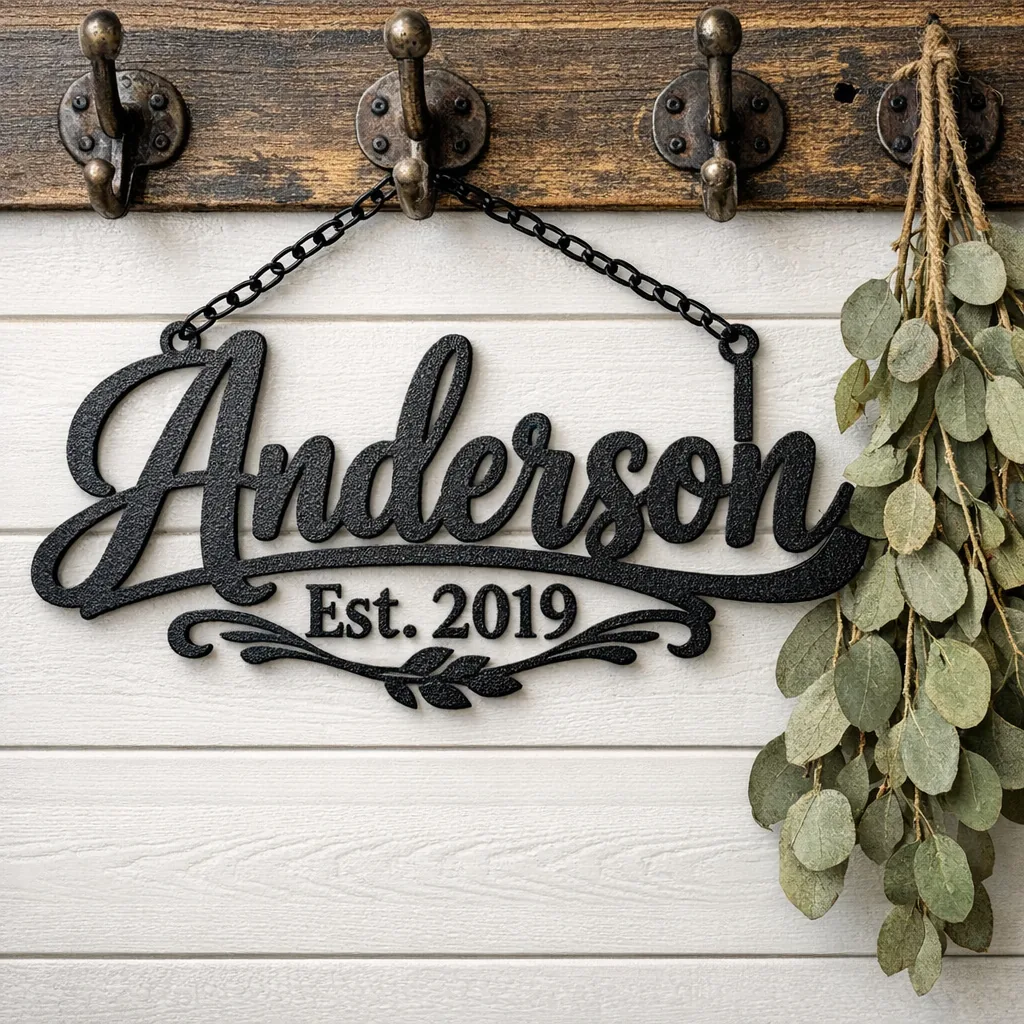
They’re thoughtful because they’re specific. Choose size based on where you expect the recipient to hang it: 24 inches for an interior spot like a kitchen or entry, 30–36 for a porch. If you’re unsure, include mounting instructions and a short note suggesting ideal locations. These signs work for housewarmings, weddings, anniversaries, milestone moves — and sometimes for reunions, long-time neighbors, or a family’s vacation home reveal.
Practical workshop advice
- Spell names carefully. Rushed orders with typos are common; double-check spelling and punctuation before you place a final order.
- Think about sightlines and lighting. If the sign sits above porch lights, pick a font weight that remains visible at night or consider adding a dedicated uplight.
- Mounting: many metal signs come with pre-drilled holes. Use masonry anchors for brick or stucco, and toggle bolts for hollow walls. If you’re mounting into wood, stainless screws are a simple solution.
- Weather: powder-coated metal holds up well outdoors. You don’t usually need extra sealants, but avoid placing a sign where soil splashes or constant pooling will occur.
- Shipping and handling: cutout signs are sturdy but deserve good packing. Ask about the seller’s packaging if you’re sending a long-distance gift.
Occasions and other uses
Housewarmings, weddings, and big moves are the obvious moments. Beyond those: businesses often commission farmhouse-style name signs for storefronts that want a relaxed, local look. Families mark reunions and vacation homes. Sometimes people order a sign simply to anchor a newly renovated entry — because it’s a small investment with a big visual payoff.
Final thoughts on picking a sign
The best piece feels inevitable — the right scale, material, and lettering so it looks like it was always meant to be there. Small personal touches — a date, initials, or a subtle motif — help a sign read as much about the people inside as the house itself. If you want something tailored, Dinozzo cuts and finishes personalized farmhouse signs in our shop; black powder coat is dependable, but the little details are what make the piece genuinely yours.
FAQ
How do I pick the right size for a porch versus a living room?
Measure the width of the wall or the furniture beneath where the sign will hang. For a bench or mantel, aim for a sign that covers about 50–75% of that width. Narrow porches suit taller, slimmer pieces; broad porches read better with longer, low-profile signs.
What personalization details make a farmhouse name sign feel more intimate?
Small factual touches — an established year, a wedding date, or first names — add intimacy. Decorative elements like a small wreath, an animal silhouette, or an ampersand between initials personalize the sign without cluttering it.
Can I mix a metal farmhouse sign with wood furniture and soft textiles?
Yes. Metal introduces contrast and visual weight that anchors softer textures. Hang a metal sign above a wooden console or among textile-heavy throws to get a layered, balanced look.
Where can I see local examples of custom farmhouse name signs?
We display many finished examples and layout options on Dinozzo’s online shop and product pages, so you can preview fonts and motifs at scale before you order.
