
News
Metal Wall Art for Office: How to Pick Size & Placement

Aug
I can’t tell you how many times I’ve had a client call after installation and say, “I should’ve measured.” The design was correct, the finish looked great, but the piece felt tiny on a lobby wall or disappeared in a large conference room. If you already picked a sign—or you’re still shopping—this guide walks through how to measure, select size, and place metal wall art in offices so the final install reads intentional and properly scaled.
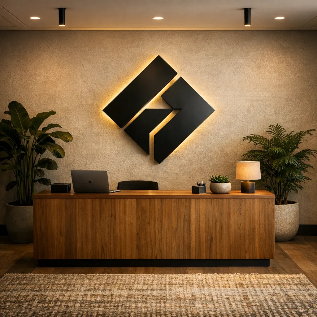
Quick note: if you’re picturing a backlit logo behind a reception desk, measure the desk height and the wall width first. Backlighting changes perceived scale and needs clearance both above and behind the desk.
Shop Custom Logo Metal Signs →
Step 1 — Measure the space before you buy
Begin with a tape measure and a simple sketch. Record wall width and usable height, then note nearby furniture dimensions: reception desk, sofa, credenza, monitor banks. Ceiling height is important too—a tall lobby behaves very differently from an 8-foot meeting room.
Here’s a rule I use: for a focal wall (the wall behind reception or the main conference wall), aim for artwork that covers roughly 60–75% of the visible wall area above the furniture. For groupings above a sofa or console, plan for art spanning about two-thirds of the furniture width. Those ranges help avoid pieces that look like afterthoughts or that try to swallow the room.
Step 2 — Choose size by location
Different office areas need different scaling. Below are practical size ideas I give customers preparing for installs.
Reception and lobby
- If the desk is 8 feet wide, a 4–6 foot wide sign usually reads well from the entry. It anchors without fighting the desk for attention.
- Taller ceilings tolerate taller artwork, but leave a comfortable margin between the desk top and the bottom of the sign so the composition can breathe.
- If you plan a backlit logo, add clearance for the light source and service access. Backlighting increases perceived scale—sometimes more than you expect—so double-check sightlines from the doorway.
Conference room
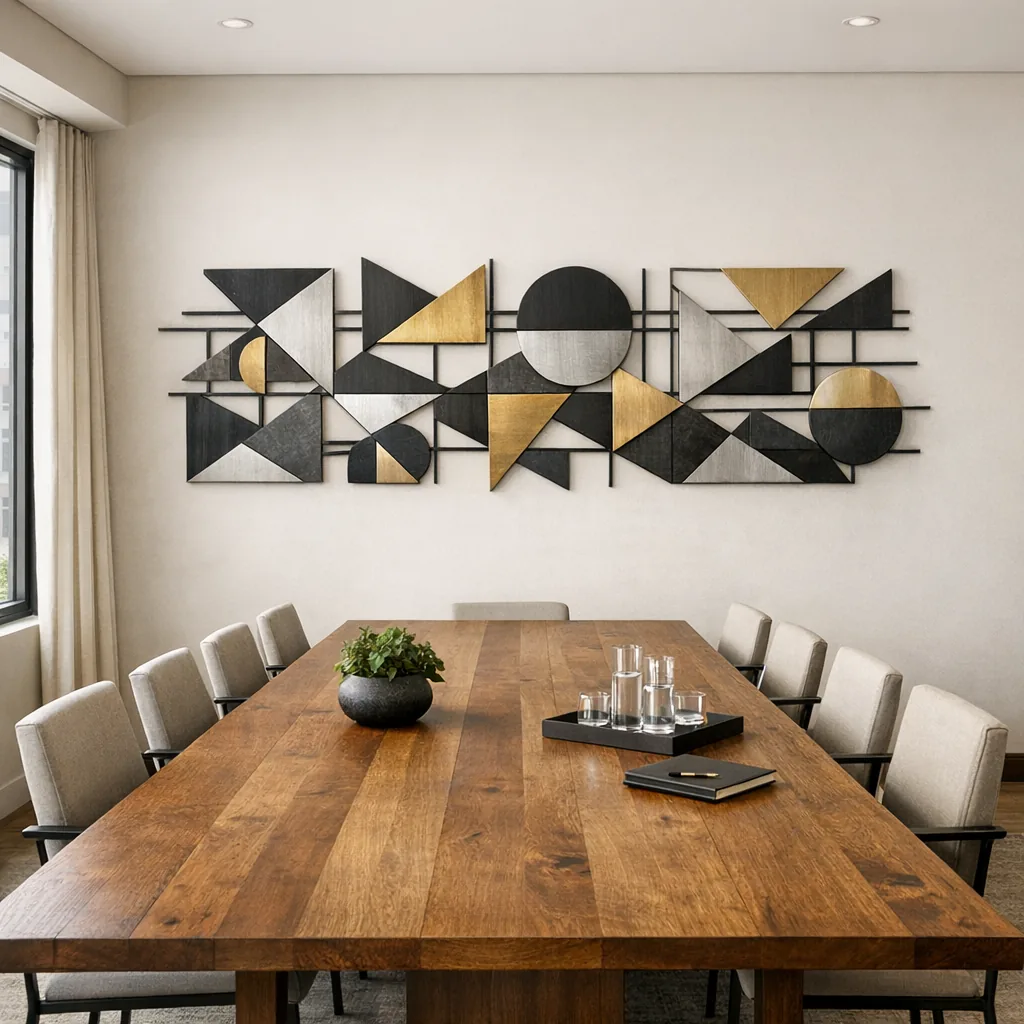
- For the wall behind the head of the table, measure the table length and aim for art that’s 60–80% of that length. That scale reads well in the room and on camera.
- Long, narrow metal panels or horizontal skylines work nicely above AV racks; they add presence without blocking screens.
- Consider the camera angle for hybrid meetings—slightly higher placement prevents the artwork from cutting off in video frames.
Executive office
- Scale the piece to the main seating area or the wall behind the desk. A 36–48 inch sign often works above a standard desk; larger rooms can take a more substantial statement piece.
- Mounting height matters if you’re frequently on video—raising the sign slightly can put it squarely in-frame without appearing low or cramped.
Waiting areas & hallways
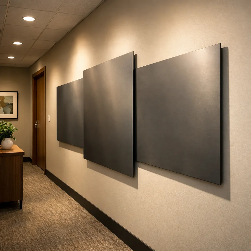
- Long walls benefit from a rhythm: multiple smaller panels (three 18–24 inch panels, for example) usually read better than a lone small piece lost in the expanse.
- In corridors, choose narrow vertical pieces spaced evenly to guide the eye down the hall without cluttering or obstructing walkways.
Home office and remote-worker setups
- Think about the camera frame. A 24–36 inch metal sign centered behind your chair often reads best on screen—professional without overpowering the view.
- If wall width is tight, pick slimmer profiles or mounts that sit close to the wall so shelves and task lights don’t interfere.
Step 3 — Pick the right shape and style
Metal tends to read crisp and modern; use that to match the room’s tone rather than fight it.
- Modern office art: geometric or abstract panels add structure without literal imagery—good for lobbies and open-plan areas where you want personality without distraction.
- Minimalist designs: thin silhouettes or openwork pieces keep things airy. They’re useful in smaller rooms or tech-forward environments where too much visual weight reads as clutter.
- Branded or personalized pieces: a company name, established year, or short mission phrase in metal reads strongly in reception and executive suites. A skyline or local map cutout can add identity without overwhelming the logo.
- Nature-inspired motifs: subtle leaf patterns or horizon lines soften hard edges and work well in waiting rooms where you want a calmer feel.
- Mixed-material compositions: combining metal with wood or stone backers can temper the industrial edge and make installation easier when you need hidden fixings.
Step 4 — Placement and mounting tips
Metal panels often weigh more than canvas or prints, so attach them correctly and plan for long-term stability.
- Use wall anchors rated for the piece’s weight. For drywall, screw into studs for larger pieces whenever possible.
- For heavier or oversized panels, a French cleat is my go-to: it spreads the load, is simple to level, and pulls the panel tight to the wall.
- Lighter decorative panels should have two hangers spaced evenly so the sign stays level and resists twisting.
- Consider vibration and traffic: pieces near doors or elevators should be mounted more securely because they’ll get bumped or exposed to movement.
- Leave breathing room. Don’t wedge art into a corner—an even margin makes the piece read as a deliberate focal point.
Step 5 — Coordinate with furniture and lighting
Treat a metal sign as one component in the room, not the only one. It should relate to furniture, finishes, and light.
- Color and finish matter: powder-coat colors are low-maintenance and photograph well. Practically, black remains popular because it anchors other finishes without clashing.
- Lighting shifts perception: a slim sconce above the piece or directional track light reveals texture and prevents distracting camera glare. For backlit signs, confirm shadow fall and service access.
- Soften the edges by pairing metal with rugs, fabric seating, or wood consoles. That balance keeps a room welcoming rather than sterile.
- If you’re concerned about reflections, choose matte or brushed finishes and avoid placing bright task lights directly opposite shiny surfaces.
How to size personalized signs and logos
Start by defining the sign’s primary use: reception logo, conference plaque, or a backdrop behind a CEO. That decision sets the size, font weight, and spacing.
When text is involved, establish a clear hierarchy. The company name or logo should be the primary element; any tagline, established date, or secondary copy should be smaller but still legible from normal viewing distances. For reception walls, favor larger, simpler lettering—ornate scripts can look elegant close up but fail at a distance.
Also consider stroke width and negative space inside letters: thin, delicate type can disappear on a large wall or under strong lighting. If readability is critical, increase letter thickness or spacing.
Using groupings and negative space effectively
One large object isn’t always the best solution. Groupings offer flexibility, easier shipping, and more visual interest.
- Stagger three or more panels horizontally to span a wall without using a single massive sheet; it’s simpler to hang and adjust later.
- Varying depths or leaving small gaps between panels creates shadow lines that add depth while keeping a tidy look.
- Maintain negative space around the cluster so the installation reads curated, not cluttered. Those empty areas matter as much as the metal itself.
- Mixing panel sizes in a controlled grid can feel dynamic without chaotic—think of a weighted center with smaller companions rather than random placements.
Final placement checklist
- Measure wall and furniture first—don’t guess.
- Match piece width to roughly 60–75% of the visible wall or furniture width for focal placements.
- Check ceiling height; taller rooms can take taller art but keep margins above furniture.
- Mount securely with appropriate anchors or a French cleat for large panels.
- Plan lighting and pair metal with soft furnishings so the piece feels integrated, not isolated.
- For logos, verify legibility from typical entry points and camera positions before finalizing size.
Want a simple comparison to demonstrate how scale and lighting change perception? A custom metal logo with LED backlight reads differently from an unlit version: the glow increases legibility from a distance, creates separation from the wall, and adds perceived depth behind the reception desk. If you’re considering backlighting, mock it up in place or use painter’s tape to preview size and sightlines before committing.
FAQ
How do I pick the right size for a reception area?
Measure the desk and the visible wall above it. Aim for artwork about 60–75% of the desk width so the sign anchors the area without overwhelming it. Double-check sightlines from the main entry and from a few lateral angles.
Can a metal sign show both logo and established year clearly?
Yes—use hierarchy. Make the company name or logo the dominant element and place the established year smaller beneath or beside it. Keep letterforms simple for distance legibility and increase stroke weight if the secondary text will be read from afar.
What’s the best mounting method for heavy metal decor?
For heavy pieces, a French cleat is the most reliable, level solution. At minimum, use anchors rated for the weight and screw into studs where possible. If in doubt, consult a professional installer—it’s cheaper than rehanging a fallen piece.
How do I make metal art look good on video calls?
Choose a piece sized to the camera frame (24–36 inches often works), mount it slightly higher so it appears behind you, and use soft, even lighting to avoid hot reflections. Matte finishes and balanced background elements help the most.
Careful measuring and a few informed placement choices go a long way. Size the piece to the room, mount it securely, and balance metal with texture and light—do those things and your sign will look like it belongs, not like an afterthought.
