
News
15+ Metal Welcome Signs for Home: Ideas to Make Yours Fit Perfectly
Aug
It happens more than you’d expect: someone orders a metal welcome sign, it arrives, and suddenly it’s obvious the piece is either lost on a large porch wall or overwhelms a narrow door. After packing and shipping thousands of signs from our Garland, Texas shop, I can tell you sizing is by far the most common avoidable problem. This guide covers the practical steps I wish every customer asked before checking out—measure first, pick the size for the actual spot, and hang it so the sign looks intentional instead of tacked-on.
Check a farmhouse-style option
Shop Personalized Farmhouse Welcome Sign →
Step 1 — Measure the space before ordering
Before you click “buy,” grab a tape measure and a pen. Record three numbers: the opening width (clear space where the sign will go), the full wall or panel width, and the typical viewing distance—how far people usually stand when they look at the sign. Those three figures tell a lot. A sign that fills 60% of an 18″ door panel looks very different on an 8-foot-wide porch wall.
Quick rule of thumb from the shop floor: for close-up spots like a door, plan for the sign to take about 40–60% of the available width. For porch walls or fences where viewers stand back 8–15 feet, aim for 60–80% of the wall so letters and details remain readable.
Step 2 — Choose size by location
Where you plan to hang the sign dictates the size more than the sign’s photo on a product page. Below are practical recommendations I give customers who call and ask, “Is this big enough?”
Front door (single door)
Doors are tight. For most single doors, 12″–18″ wide is comfortable for text to read at arm’s length. Above 24″ can feel cramped unless you have sidelights or a very wide door panel.
Front door with sidelights or double doors
Step up to 24″–36″ here. Center the sign over the handle or between the sidelights; for a family name with an established year, 30″ often balances well.
Porch wall or above a bench
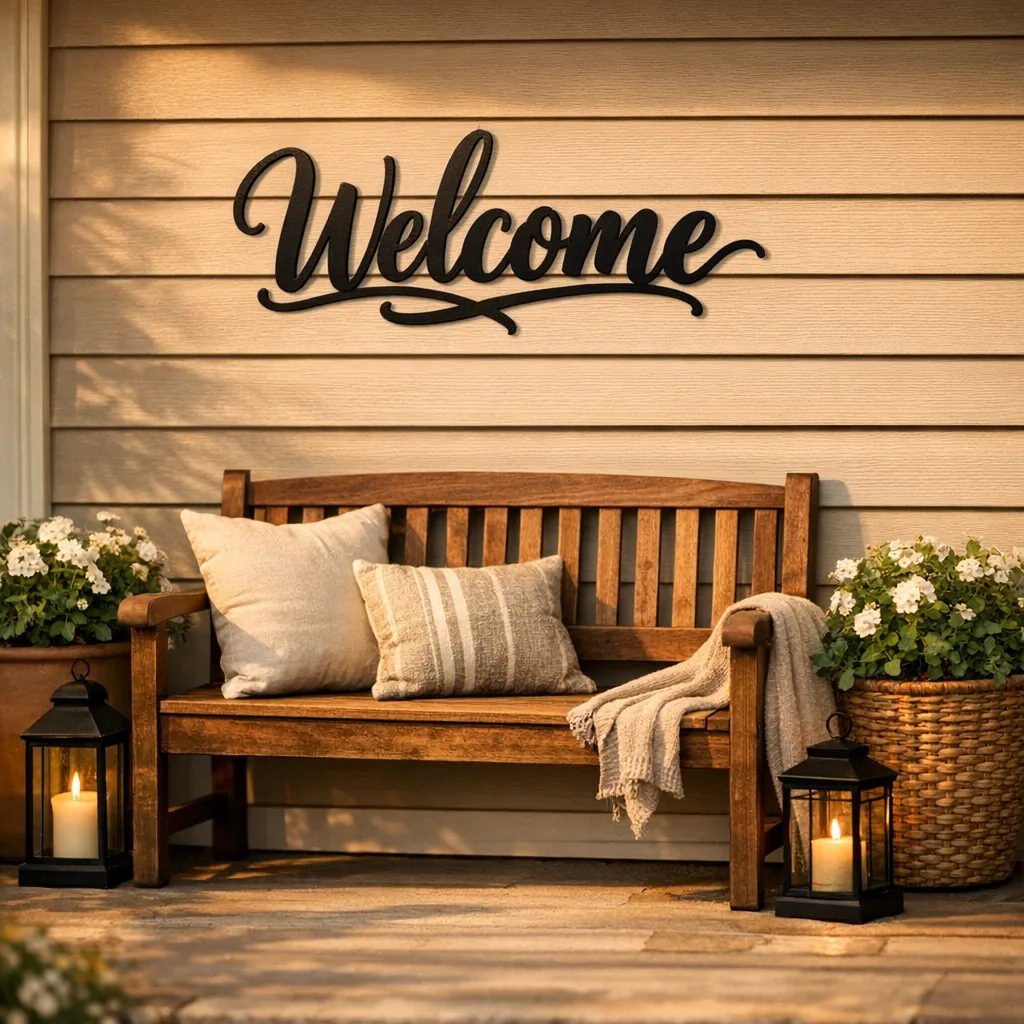
Porches are forgiving. If you’re hanging above a bench, choose a width roughly equal to the bench or slightly shorter—30″–48″ is common. For a full porch wall above seating, many customers prefer 48″–72″ for good presence without looking like an afterthought.
Garage gable or oversized shutters
Large expanses need bold pieces. Start at 36″ and go up. For a centered garage gable, measure the gable’s width and plan for the sign to fill roughly two-thirds of it; that tends to look intentional.
Garden, fence, or yard
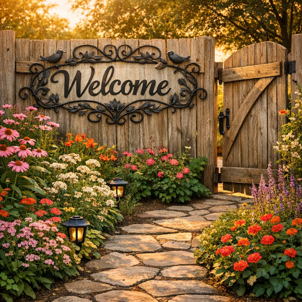
When signs are read from farther away, letter size becomes the priority. Aim for letters at least 1.5″ tall if readers are 10–20 feet away, which often means overall widths in the 36″–60″ range, depending on word count.
Step 3 — Pick a material and finish that suits the spot
Most of our metal signs are powder-coated steel built for indoor and outdoor use. Powder coat resists chips and holds color longer than plain paint. If the sign will sit on a sun-drenched porch or exposed fence, choose an outdoor-rated finish so fading and peeling aren’t worries a season in.

Step 4 — Hanging and installation tips
Signs are often light but still need secure fasteners, especially outdoors. I pack hardware lists for customers all the time; here’s practical, field-tested advice.
- Wood siding or fencing: use exterior-grade wood screws and pre-drill to avoid splitting.
- Stucco or brick: use masonry anchors and screws. Drill carefully and pick a bit sized to the anchor.
- Vinyl siding: mount a small plywood or composite backer first; then attach the sign to that so you don’t stress siding panels.
- Doors: command-style heavy-duty outdoor strips work for very light signs (under about 5 lbs). For heavier signs, use small screws near the top and bottom so the piece stays flat.
- Level tip: use a two-point mounting system. If a sign has multiple holes, measure diagonals or use adjustable fasteners so it doesn’t wobble in wind.
Step 5 — Style pairings: what to put around your sign
Simple staging makes a metal welcome sign read like it belongs rather than like an add-on. These combinations show up in our order notes a lot because they work.
- Two matching lanterns flanking a porch sign — symmetry makes a mid-sized sign feel deliberate.
- Place a small shelf or ledge beneath the sign and rotate seasonal potted plants so the eye moves down the porch.
- Combine a family-name welcome sign with a separate metal address plaque for function and personality. Our personalized bird address plaque pairs nicely with farmhouse name plates.
- Modern homes: keep surrounding decor minimal—a single planted pot and a simple doormat lets the metal sign read cleanly.
- For a layered look, try mounting a shallow reclaimed-wood plank behind the metal sign; it adds contrast and hides mounting hardware while keeping the metal crisp.
How to choose the right size: quick checklist
- Measure installation width and height; write them down.
- Decide viewing distance: 1–6 ft (door), 6–12 ft (porch), 12+ ft (yard/fence).
- Apply the percentage rule: 40–60% width for doors, 60–80% for porch walls and fences from typical viewing distance.
- Think text size: taller letters for greater distances and longer words need simpler fonts.
- Leave room for mounting hardware—don’t pick a sign that fills the entire gap edge-to-edge.
Design ideas that work well in each spot
- Farmhouse welcome sign: pairs with galvanized planters; 24″–36″ suits most porch walls.
- Minimal front door sign: 12″–18″ for a clean, uncluttered look.
- Botanical or floral motifs: place above benches or over planters so the artwork echoes nearby greenery.
- Pet-themed signs: tuck these near a mudroom or side door—smaller sizes keep visual clutter down.
- Address + welcome pairing: mount the house number slightly higher and center the welcome sign underneath so both read clearly at once.
Common mistakes I see (and how to avoid them)
- Ordering before measuring. Don’t. Measure first.
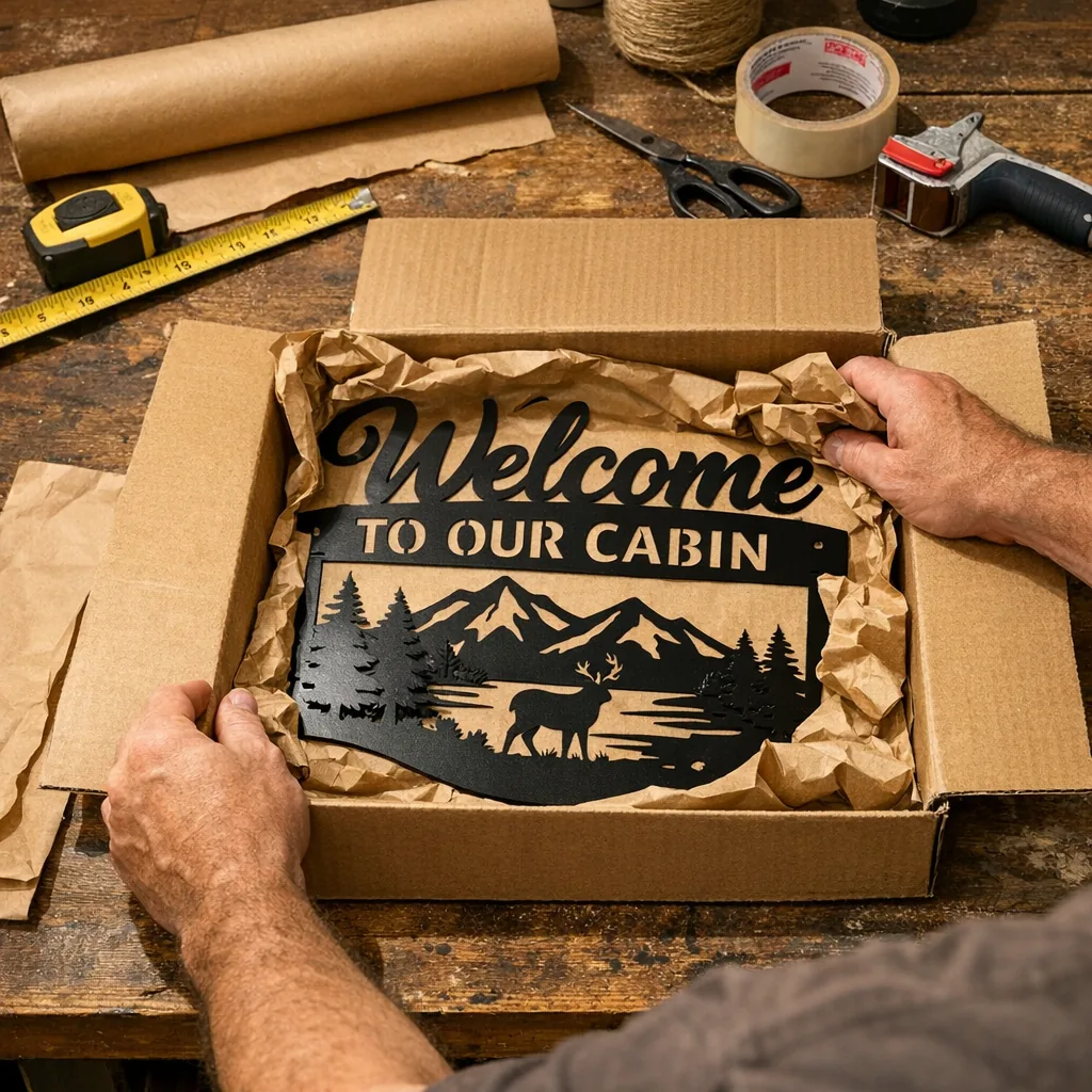
- Forgetting to allow for mounting hardware—holes, brackets and backers eat a few inches around the edge.
- Choosing super-detailed script for long names. Long family names benefit from bolder, simpler fonts so they read at a distance.
- Underestimating wind. Lightweight, large signs need extra anchors and sometimes a backing board to keep them steady.
- Ignoring background contrast—dark signs on dark siding disappear; pick a finish that contrasts with the mounting surface.
Placement examples from real customers
A customer in Ohio ordered a 36″ farmhouse name sign for a covered porch and it fit a three-seater bench perfectly. Another buyer in Arizona originally bought a 14″ sign and returned it as too small for their 10-foot-wide garage gable; they re-ordered a 48″ sign and were much happier. Those notes are why I keep pushing measuring first: context—not just the photo—decides the right size.
Finishing touches and personalization tips
If you personalize with a family name or an established year, center the main line and tuck the year to the lower right or left so it doesn’t compete with the name. Small composition choices like that keep things legible and balanced. Black remains our most popular color because it reads well against many backgrounds; if your siding is dark, pick a lighter powder coat so the letters pop. For two-color looks, a subtle inner accent on raised elements helps legibility without shouting.
FAQ
How big should letters be if my porch is viewed from the street?
For curb-to-porch viewing (about 15–25 feet), letters should be at least 2–3″ tall. That often means an overall sign width of 36″ or more, depending on how many words you have.
Can I hang a 48″ metal sign on vinyl siding without damaging it?
Yes—use a backer board. Mount a thin piece of exterior-grade plywood or composite to the siding, then attach the sign to the backer. That spreads the load and prevents siding panels from flexing or cracking.
How do I size a personalized family-name sign for double doors?
Measure the center panel area or the width between door frames. For typical double doors, 30″ is a safe middle ground; for very wide entries step to 36″ or larger. Keep fonts simple if the name is long so letters remain readable at a glance.
Any tricks to keep a sign level on an uneven wall?
Yes—use two adjustable French cleats or keyhole slots with washers you can tweak from the front. Small felt or rubber pads at the bottom corners help the sign sit flush and stop rattling in wind.
If you’ve already measured, you’ve done the hardest part. From packing orders every week, the most successful installs are from customers who matched sign width to the wall and considered viewing distance. If you want a starting point, compare a few styles and sizes against your measurements. For porch proportion examples, see the personalized farmhouse welcome entry sign.
Need help picking a size? Measure the width, note the viewing distance, and send those details to customer support—tell them where you’re mounting it and we’ll recommend the sizes we usually pack for similar installs.
