
News
Custom Loss of Parent Memorials: A Behind-the-Scenes Guide
Aug
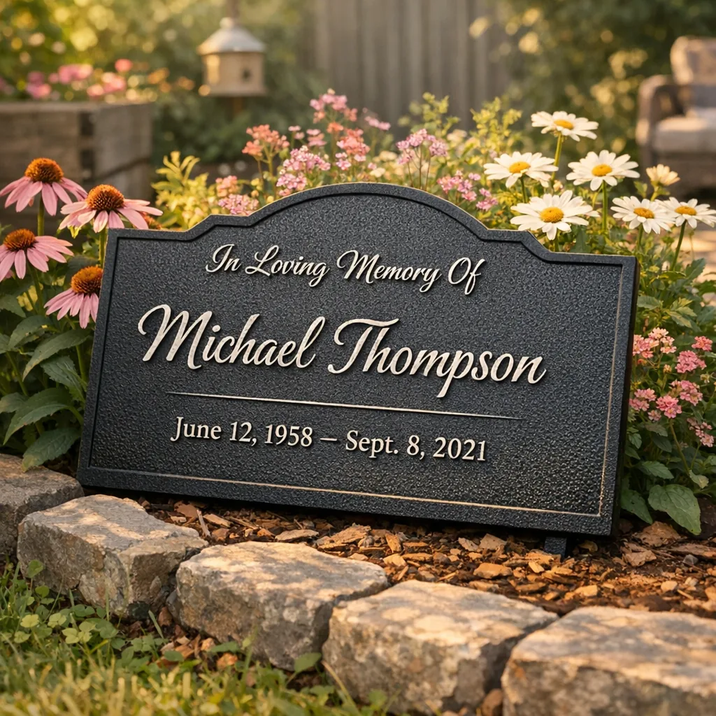
Behind every metal sign on a porch or tucked beside a favorite tree is a process that started with a person and a memory. When someone orders a custom loss of parent memorial, they’re usually after more than a plaque — they want a small, steady place to visit a memory, to read a name, or to feel a familiar laugh come back for a minute. I’ve seen these pieces shipped for Mother’s Day remembrances, quietly tucked into a memorial garden, or handed to a sibling after a service. They matter. We treat them that way.
Cardinal Mom Dad Personalized Memorial Garden Stake
Design & Laser Cutting: shaping a memory
Most custom memorials start with the words. A name, birth and passing dates, maybe a short line a family always says — “Always my girl,” “Gone fishin’,” or a one-line Bible verse. People send little notes with orders: “Dad loved his fishing pier,” or “Her garden was everything.” That tells us how to arrange text and where to give space for a small symbol: a fish, a rose, a tool, a musical note.
On the shop floor I load the steel and watch the laser follow the path we drew. The cutting is precise, but it’s not magic — it’s muscle and experience, and a lot of double-checking. If a name is misspelled on the form, we catch it sometimes because a human reads every file before it goes to the table. One time someone ordered too late and we stayed late to make it for the funeral the next morning. We do that when we can. This stage decides the silhouette — the heart, the house outline, the tree — that will become your keepsake.
Surface prep & powder coat finish: protecting what you remember
Steel is a good storyteller but it needs protection to last outdoors or over a mantel where sunlight and dust live. After cutting, parts are cleaned, sometimes lightly sanded, and then sent for powder coating. The finish we use resists fading and holds color longer than paint in my experience. Black is still our best-seller — simple, clear, readable from a few feet. But I’ve packed soft ivory signs for a memory table and forest green for a marker beside a shady tree.
That finish is more practical than pretty: it keeps the piece looking like it did on day one whether it sits beside a flower bed or on a living room wall.
Quality check: the small things that matter
We open the box and inspect the cut edges, the lettering, the alignment. I look for burrs, chips in the coating, any stray marks. For memorials especially, people notice the details: is the heart centered, is the date legible, does the tiny symbol read like a bird or a smudge? I once caught a spacing issue on a larger sign that would have pushed the year down one line — the customer told us later that the corrected sign hung over their fireplace for years.
We also consider mounting: keyholes, stakes for the garden, or a simple flat-back for a shelf. Suggesting the right mounting is part of quality control; it’s how we help the piece feel placed, not just set down.
Packing & shipping: sending something steady
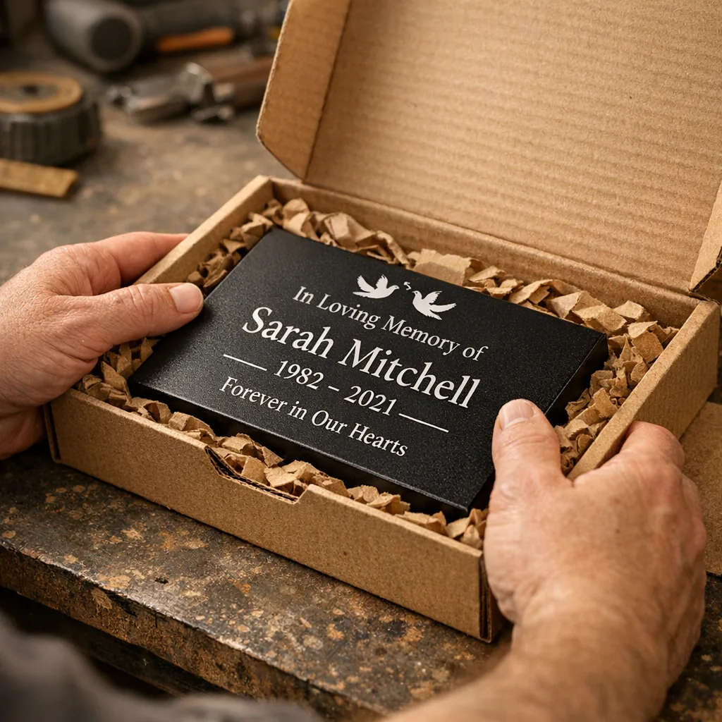
Packing a memorial is like wrapping a letter to a friend. We cushion, label, and include a small care note with suggestions: where to hang it, how to mount it by the hearth, or how to place it near a favorite shrub. Families sometimes request one-day turns after a service. When that’s the case we mark the box and call it out. I’ve hand-stamped extra bubble wrap into a package at midnight more than once.
Personalization ideas that actually help
- Name + dates: the basics that anchor memory.
- Short quote or family line: the phrase Grandpa said at every dinner; a mom’s cookbook title line.
- Symbols tied to hobbies: a fishing hook, a tractor silhouette, a paintbrush, or a simple flower.
- Location nods: a small lake wave, a mountain line, a porch swing outline — subtle cues that make a piece unmistakably theirs.
- Dual-parent memorials: two names with a shared date or a connecting symbol. Simple and quiet works best.
People often ask which of these reads best from a distance. I’d go with larger, bolder lettering for a sign meant to sit in a garden; fine script works beautifully on a shelf plaque.
Where people place memorials
The spot you choose matters because it becomes part of the ritual. I’ve handed memorials to customers who planned to set them:
- in a memorial garden or flower bed — tucked into soil near perennials
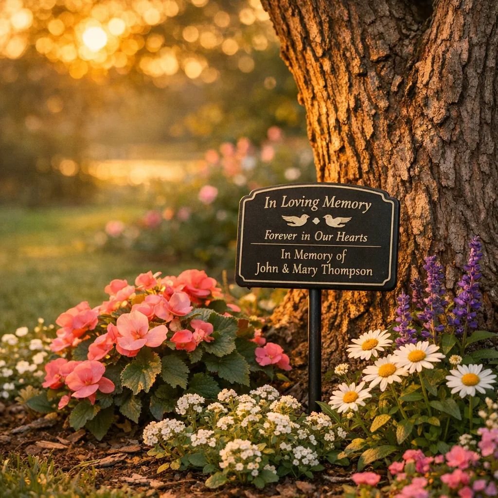
- beside a favorite tree — a small sign at knee height where a person used to sit
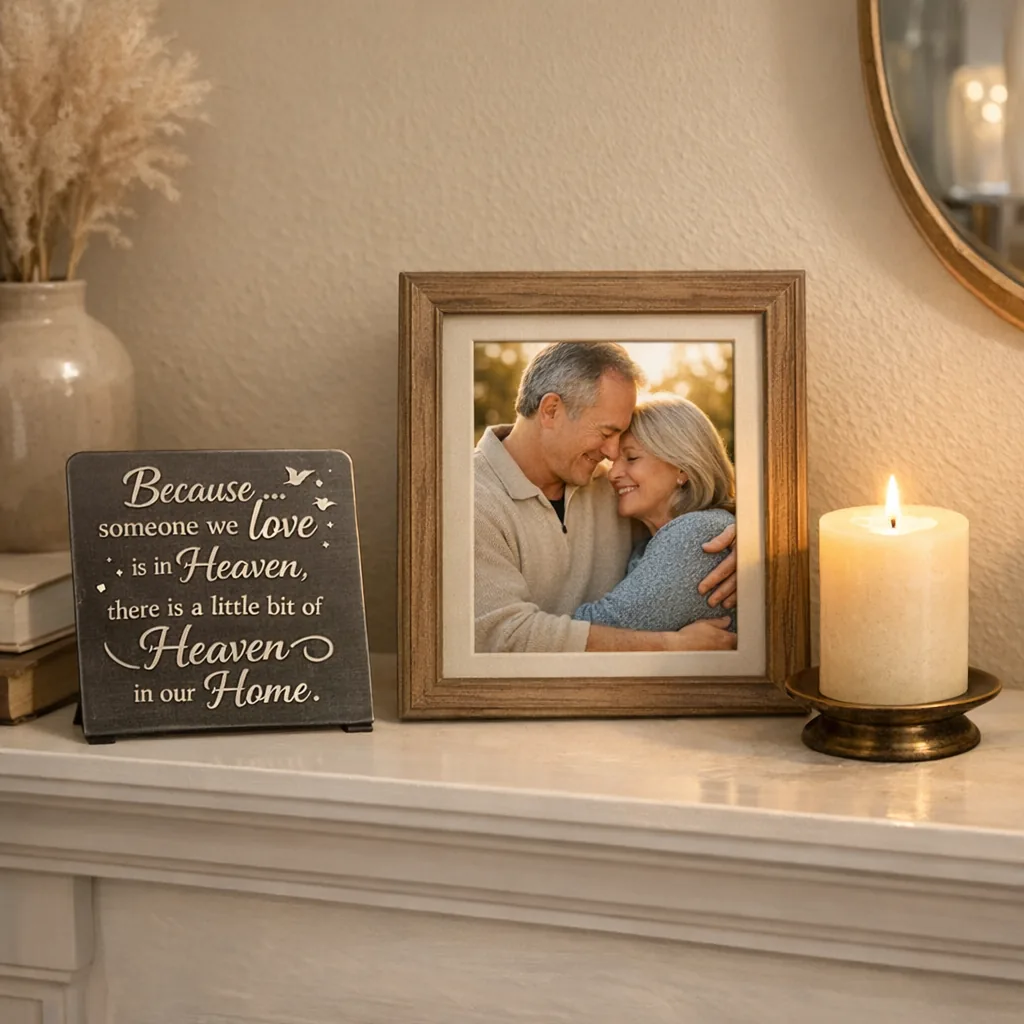
- on a fireplace mantel or memory table — paired with photos and a candle
- on a porch — visible from the driveway so visitors see the name
A sign placed where the family naturally spends time — the back porch after a backyard remodel that just wrapped up, the front hall where winter boots come off — becomes a quiet habit of remembrance.
Choosing a design based on who they were
Think about how your parent liked to be remembered. Was your mother happiest with dirt under her nails, tending roses at 7 a.m.? Was your dad the one who loved lawns, coffee shops, or road trips? Let personality guide the symbol and the tone of text. For a reserved person, choose minimal shapes and crisp text. For someone with a wilder laugh, consider a flowing script or a more playful icon.
When families bring photos, we talk over how to translate a detail into a small cut symbol — a fishing boat, a cat silhouette, a particular flower. Keep it simple; tiny details don’t always cut clearly at small sizes.
Gift ideas and what people actually choose
When someone orders a personalized memorial gift after a loss, they usually pick one of these approaches:
- A small shelf plaque with a short quote and dates — easy to deliver and easy to place on a memory table.
- An outdoor garden sign on a stake — meant to be visited with flowers and the quiet of a backyard.
- A paired set for both parents — two small signs displayed together or hung side-by-side.
- A keepsake-sized metal heart or ornament — something that fits in a box with letters and a photograph.
These are the pieces people keep returning to. We pack them carefully, label them as gifts if requested, and sometimes include a note about mounting for the recipient.
Why a custom memorial is more than decoration
It’s not about filling a wall. A custom loss of parent memorial creates a steady reference point — a name to read, a line to say. It helps mark a place where a family can pause, remember a small habit, and share a story. I’ve watched grown kids trace lettering with a fingertip and laugh about something silly Dad used to do. That’s the work the shop is doing: turning a memory into something you can hold in your hand or stand beside in the yard.
Custom loss of parent memorials — practical tips from the shop
- Pick readable font sizes for outdoor signs; smaller script is beautiful but loses legibility at distance.
- Choose one symbol that clearly ties to the person — less is more.
- If you need it fast, say so in the order notes. We check those and will call if we can’t meet the date.
- Think about placement before you order: garden stakes need shorter wording; mantle pieces can be longer.
FAQ
How does the laser cutting process affect the wording I choose for custom loss of parent memorials?
Laser cutting is precise but favors simpler, bolder lettering for small or outdoor pieces. Long, ornate lines can blur on smaller signs, so we often recommend short names and dates with a single short phrase or symbol to keep the message legible and strong.
Can a memorial made for outdoors handle Texas summers or salty air if placed near the coast?
The powder-coated finish is chosen to resist fading and weathering better than raw metal, which helps in sun and humidity. For coastal locations we advise checking mounting methods and avoiding direct, constant salt spray if possible, but the finish is meant to be long-lasting for outdoor display.
What size and mounting should I pick if the memorial will sit beside a favorite tree?
For a sign near a tree, a lower-mounted garden stake or a small flat plaque attached to a low post works well. Think about viewing height — you want it readable when you sit or kneel by the tree, not only from across the yard.
How do I choose wording if I’m making a dual-parent memorial?
Keep it balanced: two names with shared dates or a connecting phrase between them reads cleanly. A single shared symbol (a heart, a simple line drawing of a home) often ties the two names together without overcrowding the piece.
Are there common personalization mistakes to avoid?
Typographical errors on forms are the biggest issue. Double-check spellings and dates. Also avoid cramming too many lines of text into a small sign; fewer words are easier to read and feel more intentional.
